Project 6 Stationery

Letterhead:

P6MarinaSanchezStationary


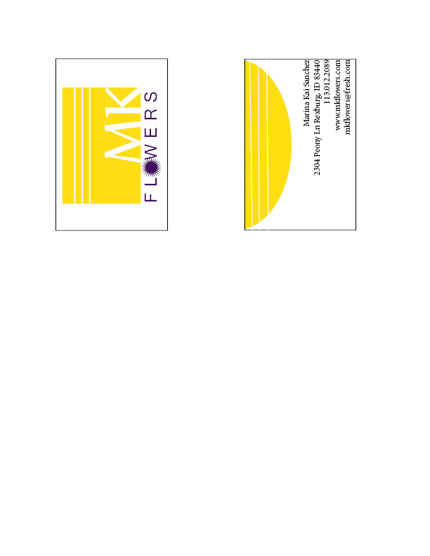
Business Card (8.5×11 layout):

P6MarinaSanchezBCreg


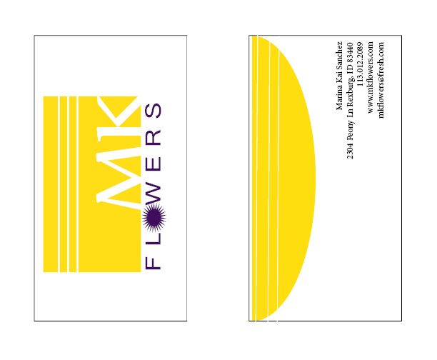
Business Card (8.5×7 layout):


P6MarinasanchezBClrg


Description:
Matching letterhead and business card designed using a personally created logo.

Process (Programs, Tools, Skills):
I created the logo using simple shapes in Adobe Illustrator. I also used the pathfinder tool to cut and combine these  shapes. Once created, I opened a new InDesign document and placed my logo.ai file into this document.

I decided to make my first page a letterhead. I positioned the placed logo in the top right corner of my letterhead. I made sure to keep it at least .5″ away from the edges. I then typed my contact information into a text box and positioned it on the right hand side of the letterhead.

On my second page I used the rectangle tool to create the front and back outline of my business card. I then copied/pasted the logo and contact information onto this page. I kept the logo and contact information about the same size as the information on the letterhead. I made sure that no important information came any closer than 1/8″ from the edges. I also brought the 3 white lines into the business card to help unify the stationery pieces.

Programs/Tools Used: Adobe Illustrator & InDesign

Message: The company is to sell flowers for all occasions. With the bright yellow we are trying to show a light friendly feeling.

Audience:  Anyone in need of flowers for any occasion.

Top things learned: How to brand a company using a unified letterhead and business card design.

Color scheme: Complementary and color names: Gold and Indigo

Title Font Name & Category:  Century Gothic- Sans Serif and Biondi-Slab Serif

Copy Font Name & Category: Minion Pro- Slab Serif

Project 4 Montage


P4MarinaSanchez


  1. Description: This is an inspirational montage created by the blending of two images, and the use of typography.
  2. Process (Programs, Tools, Skills, Steps taken while designing):

1. I cropped the background picture to 8.5″x11″

2. I took the photo of the typewriter and moved it onto the background image and created a mask.

3. With black paint and a 100% opacity, soft-edged brush, I painted away the hard image edges.

4. With a slightly larger black brush at 47% opacity and 100% flow, I blended part of the the image into the background, so it looks like the sheet of paper is melting into the sky.

5. I added some type with a complementary font and I added a layer style (overlay) to make the text more legible, and whimsical.

2. Message: I wanted to convey the importance of being yourself. And as a long time Doctor Who fan, there have been many quotes that portray this. I chose this one though because it pertains to a larger mass than an older quote. But paired it with a typewriter, which at this particular date we don’t see as much, but it still is a “model”, something we know and are comfortable with.

3. Audience: Doctor Who fans, and also people who love typewriters.

4.Top Thing Learned: The top thing that I learned doing this project was how to properly make a mask on my layers so that I could blend images together.

5.Filter / Colorization used and where it was applied: I did not use any filter on the picture. The images had the right amount of color to them.

6.Color scheme and color names: Monochromatic- Blue, With added white and black

7.Copy Font Name & Category: Courier New Bold Italic, Slab Serif

8.Thumbnails of Images used:

NightSky

Typewriter


9.Sources (Links to images on original websites / with title of site):

https://unsplash.com/

Unsplash: Free High-resolution Photos

Project 3 Photo-Design

P3MarinaSanchezDescription: Demonstrate good photography and image editing skills. Incorporating color into a poster layout with original photo.

Process: I first formulated my poster by choosing a color scheme from the Visual FOCUS book for my layout, I decided on Complementary.  Then after an hour and a half photo shoot, I had  a quality photo with good light, sharp focus, and nice composition.  I used a Canon Powershot SX40 HS camera. I took the photo into Photoshop and used these specific editing techniques: levels, sharpness, saturation, and color balance.  Then I designed a 11×8.5 layout that included my photo, text, and repeating design elements. I incorporated my color scheme, title/quote, color swatches, and color names into my design.  I used the eye dropper tool and adjusted the color in the color picker to match a little more accurately.

Message: The message of this poster is specifically for my husband. He forgets sometimes how much he really does and this was to remind him that even the little things he does don’t go unnoticed.

Audience: Other than my husband, I wanted anyone who saw it to be motivated. To realize that they are “great”.

Top Thing Learned: The hardest thing for me was getting the photo to size right moving it from one Photoshop doc to another. But after a bit of struggle and patience I was able to do it.

Color scheme and color names: Complementary- Brick and Teal

Title Font Name & Category: Microsoft Phagspa Bold-Sans Serif-Size 30

Copy Font Name & Category: Microsoft Phagspa Bold-Sans Serif-Size 14

Thumbnail of original, unedited image:

Original Image


 Date and location you took the photo: Tuesday February 3, 2015 Rexburg Idaho Temple

Project 2 Event Ad

A4MarinaSanchez-page-001


  1. Description: An Advert made using only Microsoft Word and a scanner.
  2. Process (Programs, Tools, Skills, FOCUS principles): I scanned the image, and then used Word to rotate and clean up the picture. I chose two fonts and the one used for the body copy i used contrasting weights for emphasis. I had former experience with Micrsoft Word, and was suprised how easily the new features I learned were to use. The programs I used: Microsoft Word, Epson Perfection V500 Photo Scanner, PDF2JPG.net (PDF converter).
  3. Message: The message I am making is that the High School is having a bake sale to raise funds to go on the senior trip.
  4. Audience: The community, including other students.
  5. Color scheme and color names: Triadic-  Blue, Beige and Dark Green
  6. Top Thing Learned: How to use a scanner properly
  7. Title Font Name & Category: Britannica Bold- Sans Serif
  8. Copy Font Name & Category: Cambria- Slab Serif
  9. Scanned images used, sources, original sizes, location of scanner used:
    • Source of image used National Geographic Magazine: May 2011
    • Size, in inches, of original image scanned: 4×6
    • Scanner used (Make, Model and location): Epson Perfection V500 Photo, Spori Computer Lab Room 107